


Build custom, structured Excel reports from monday.com board data and send them automatically to the right people on schedule.


How to match your monday.com client portal to your brand
Bring your colors, logo, language and portal address together into a familiar client experience. Follow a practical branding example and check the result from the login page to everyday work.

Table of contents
Use the navigation below to quickly jump to your desired section and learn more about each topic.
A client follows an invitation link, signs in and opens their projects. Each step should feel like part of the same service: a recognizable address, a familiar logo, clear page names and content they can read comfortably. Branding helps connect those steps.
With Client Portal Builder for monday.com, your team keeps managing the work in monday.com while shaping the client experience through theme settings, portal content and a custom domain. This guide explains how those pieces work together, how to choose between them and what to check before inviting clients.
Client Portal Builder creates a dedicated client facing layer around the boards and workflows you already manage in monday.com. Give clients secure access to selected information and actions without rebuilding the underlying workflow somewhere else.
Client experience
Start with the experience clients should recognize
Imagine Brightline Studio, an agency whose clients already know its dark blue brand color, logo and straightforward project emails. The agency wants its portal to feel like a natural continuation of that relationship. It needs a readable theme, a recognizable sign-in page and clear routes to Projects, Invoices and Contact.
Gather the brand color values, a suitable logo file, a preferred typeface and the words your clients already use. If you want a custom domain, find out who can manage its DNS settings. Theme adjustments may be quick, but preparing assets, connecting the domain and reviewing the result need their own time.
Recognizable invitation and address → familiar login page → clear navigation → readable client content
Theme
Set the visual foundation in the Theme tab
Open the Client Portal Builder view next to your Clients Board and switch to the Theme tab. It brings together the main theme controls, with a small layout preview that updates as you change colors and the logo:
- Colors for the overall look and for system states
- Font from a list of Google Webfonts
- Logo shown in the navigation and on the login page
- Collapse sidebar by default for a more compact layout
Theme changes stay in the draft until you click Publish. Use Preview draft to review the full pages as you work. The theme documentation covers the individual settings; portal name, interface language, login text and domain are managed separately in Settings.

Colors
Start from a preset, then match your brand
Start with one of the color presets at the top of the Colors card, then adjust it to your brand. Brightline Studio might choose a preset close to its dark blue primary color and adapt the main colors while keeping text and controls readable:
- Primary for the navigation, buttons and highlighted sections
- Secondary for content on top of the primary color
- Text for headlines and body text
- Surfaces for backgrounds of cards and sections
- Success, Warning and Error for status feedback, such as a confirmation after a client saves a change
Check the colors together on real content: a button label, a paragraph, a table and a highlighted section. A brand color that works well in a large logo may be difficult to read behind small text. Keep enough contrast between text and backgrounds, and adjust semantic colors within their base shades so success, warning and error feedback remain recognizable.
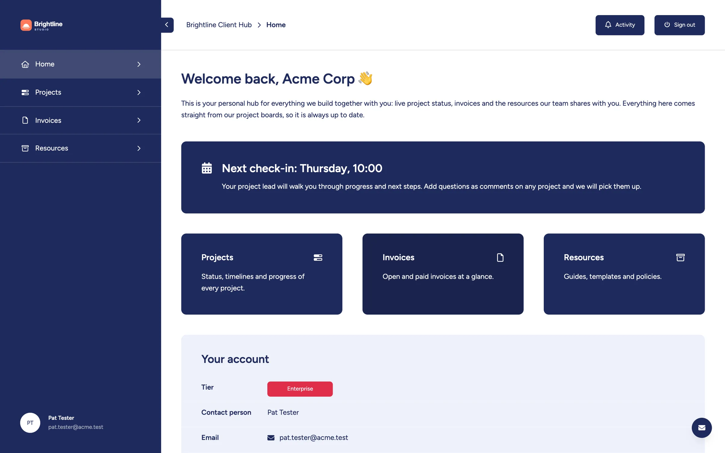
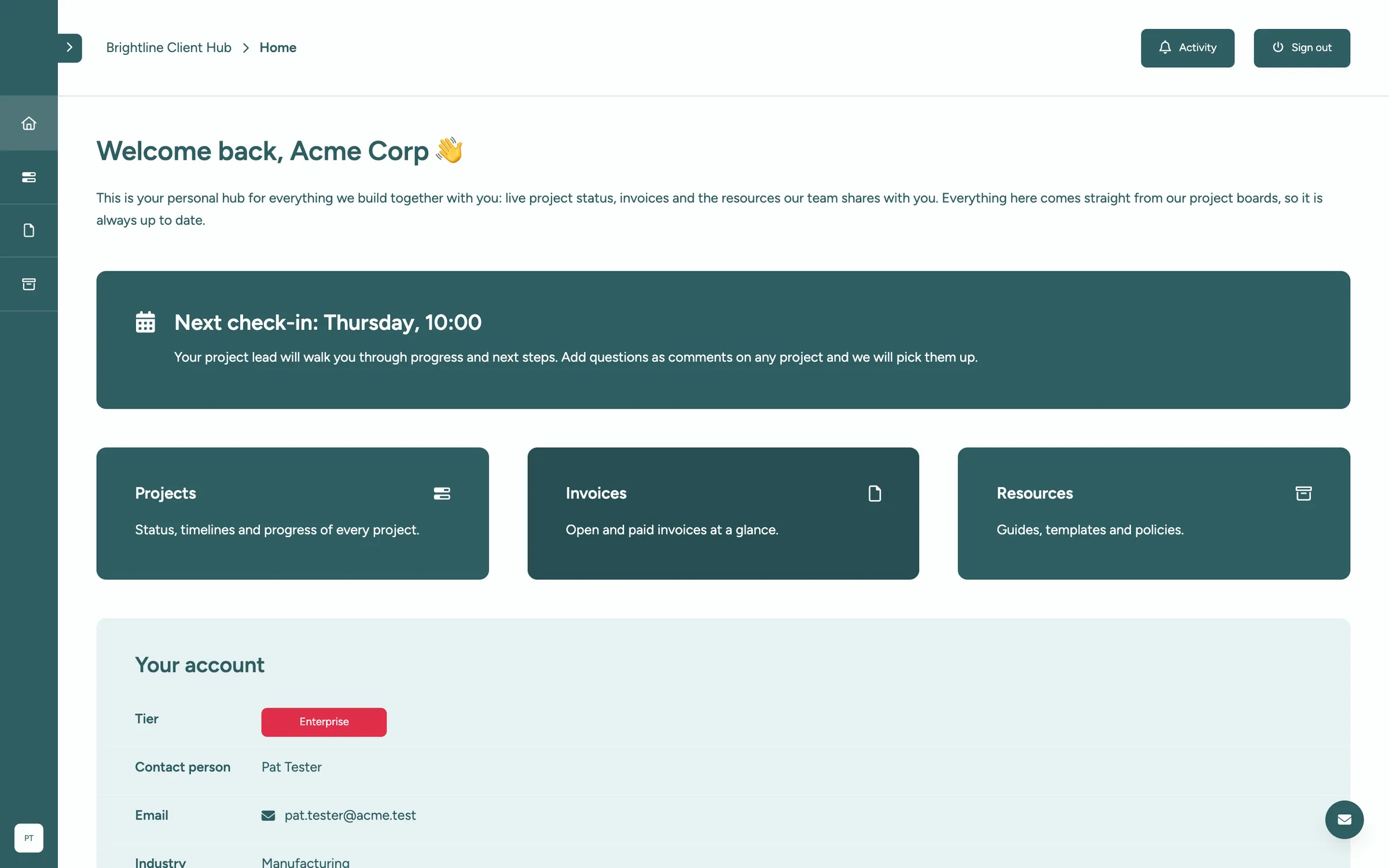
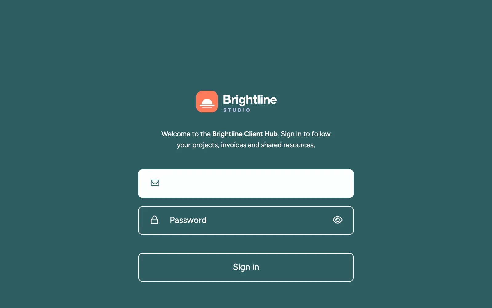
The slider above compares Brightline Studio's dark blue theme with an alternative teal preset and a collapsed sidebar. The teal version demonstrates how a theme change affects the same portal; its pages and data stay the same. Theme defaults update together, but individually selected colors, such as a teaser card background, can remain unchanged. Review those sections when changing the theme.
Font and logo
Use your typeface and logo
Choose a supported Google Webfont close to your brand typeface, then check it in headings, paragraphs and tables. Brightline Studio does not need an exact typeface match if a supported alternative makes its project information easier to read. Custom font uploads are not supported; see the available fonts, or contact us about another Google Webfont.
Upload a transparent PNG or SVG below 100 KB. The logo appears in the navigation and on the login page against your primary color. Choose a light version for a dark background or a dark version for a light background. Check small lettering and fine details at the size clients will actually see, rather than judging only the original file.

Layout
Give content more room with a compact sidebar
Turn on Collapse sidebar by default when your portal has only a few pages, or when clients mostly look at wide tables. For page icons to remain visible in the collapsed navigation, every portal page in the main navigation must have an icon. Clients can expand the sidebar at any time to see the page names.
For Brightline Studio, the choice depends on whether clients recognize the page icons without their labels. Keep the sidebar expanded if the labels help them find their way. On phones, the portal switches to a top bar with your logo and a menu; check that the logo remains readable and the page names still make sense there.
Login page
Make the first screen feel familiar
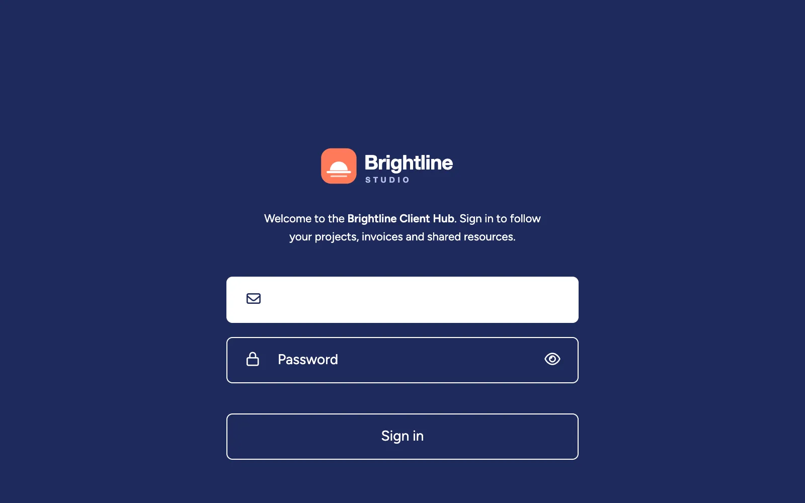
The login page is often the first thing a client sees, straight from an invitation email. It uses your logo and primary color, and the Login Text setting in the Settings tab adds a short welcome above the form. It supports Markdown, so you can highlight your portal's name, link to a password reset form or point to a contact address.
Brightline Studio's login page says: “Welcome to the Brightline Client Hub. Sign in to follow your projects, invoices and shared resources.” If you also add a support address or link, choose one your team actually monitors. If you add a reset form, configure the process behind it as well; adding a link does not create password recovery automatically.
For everything about how clients sign in, from login methods to password resets, see how to manage client access and logins in a monday.com client portal.
Domain
Put the portal on your own domain
A portal at portal.yourcompany.com is easier to remember and builds more trust than a generic address. Choose an address your company controls and connect it through the Settings tab and your DNS provider, following the custom domain instructions. Once the domain is connected, you can redirect the default address to it, so clients always end up on your domain.
A custom domain is also required if you want clients to sign in with Google. The step-by-step setup is described in how to connect a custom domain to your client portal.
Words
Speak your clients' language
Branding isn't only colors. The words in the portal shape how it feels just as much:
- Portal name and language: choose a name clients recognize and set the interface language in Settings. The language applies across the portal, not per client, and does not translate your board content or written text.
- Column names: rename board columns for clients, for example
Invoiceinstead ofNameorProgress %instead of an internal column title, in the column settings. - Personal greetings: use placeholders such as
{{client.name}}in headlines and texts, so each client is greeted by name. - Formatted text: use Markdown in text sections and callouts for emphasis, lists and links.
For Brightline Studio, that could mean calling a page Projects, a column Next review date and a contact section Your project team. Keep those terms consistent with the invitation and login text. Use personalized views when content needs to vary by client, while keeping the overall brand consistent.
Verification
Review the whole experience before inviting clients
Use Preview draft to review representative client pages on desktop and at a phone-sized width. Include realistic content, such as long project names and populated tables, so you can judge the theme in everyday use.
- The logo is readable against its background in both the navigation and login page.
- Headings, body text, button labels and table content remain easy to read.
- Success, warning and error feedback remain distinguishable, and individually colored teaser cards still fit the theme.
- Page names and icons help clients find Projects, Invoices and support without knowing your internal board names.
- Long client names, headings and column labels remain usable on smaller screens.
- The login welcome explains the portal's purpose, and its help or reset links lead to working processes.
- Interface language and client-facing content are consistent for the audience using this portal.
Publish, then check the client entry point
Once the draft looks right, publish it and open the client-facing address in a private browser window. Check the actual login page, follow its help links and confirm that your custom domain and any configured redirect work. Sign in with a test client to check the published navigation and content on desktop and a phone.
Preview helps you review a draft, but it does not replace checking the published login page and address. Make these checks before sending the invitation to clients, and use sample items if you test actions that change board data.
Keep the address, logo, colors and language familiar, then give the client's work room to stand out. Revisit the same checks when changing a theme, adding pages or introducing a new type of content.
Summary
Your brand in front, monday.com behind
Start with the experience clients already associate with your business, then carry it through the portal address, login page, navigation and content. Use Theme for the visual foundation, Settings for the entry point and clear wording throughout the pages.
Review the draft with realistic content, then check the published experience before sharing it. Your team keeps managing the underlying work in monday.com, while clients get a familiar place to find information and take the next step.
Brand your client portal
Client Portal Builder for monday.com lets you give clients a portal in your own colors, font, logo and domain, built on the boards your team already uses. Read more about the theme settings in the documentation.
Interested in a product demo?
Let's learn about your requirements, answer questions, and
review ways how we can help you and your organization with
our monday.com apps and solutions.
